


Church Online Platform (CHOP) is a B2B SaaS product that provides streaming and content management tools to churches worldwide. Think of it like this:
Similar to: Vimeo + WordPress + Mailchimp, but specifically for churches.
Scale: Serves 3,000+ church organizations globally.
Each church: Has its own account, multiple users, custom branding.
While the product served churches globally, its own marketing website lagged behind. Pages were difficult to update, the visuals felt outdated, and the conversion rate hovered around 15%.
Business Challenges
I had to design for all three groups (Church leaders, Church admins, and Internal Stakeholders) simultaneously—the decision-maker who evaluates the platform, the manager who runs it, and the content creators who use it every day. Each has different needs, but all must be satisfied for the platform to succeed.
.png)
.png)
.png)
💡15% signup conversion rate
💡46.7% new users comes directly
💡17.5% users first click feature to decide if they want to sign up
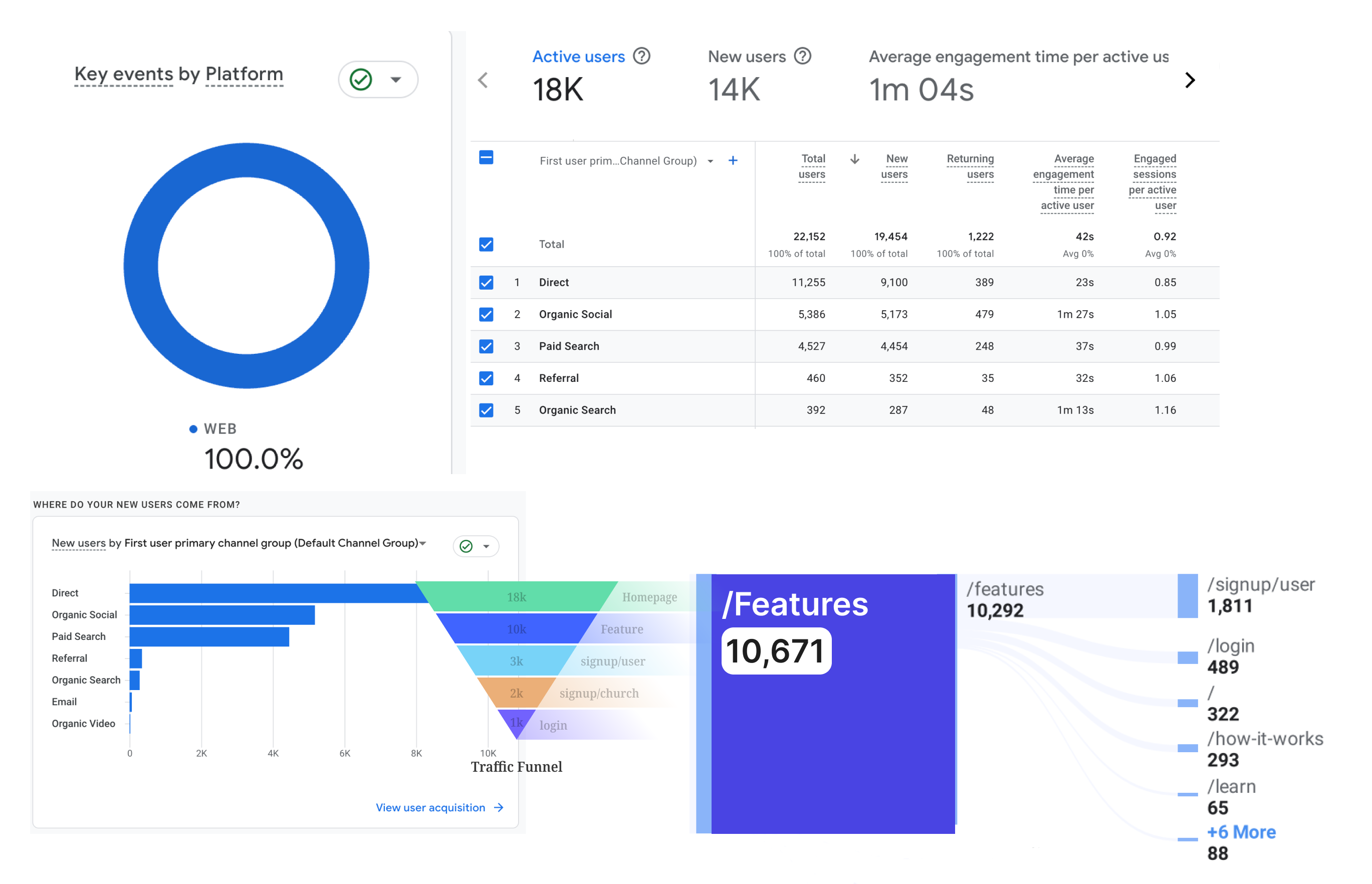
Conducted with 5 stakeholders to identify pain points:
✅ Admins/Content Creators needed faster content updates for seasonal campaigns
✅ Church leaders wanted clearer explanations of platform features
✅ Trust-building elements like testimonials and recognizable clients matter
✅ Clear CTA placement (hero sections, repeated through flow)
✅ Use of modular, clean layouts improves usability and page speed
Competitive audits showed that platforms like Mailchimp and Eventbrite used modular layouts, strong social proof, and focused CTAs—three principles I wanted to integrate


With research insights in mind, I structured the redesign around three pillars:
1. Modularity 2. Clarity 3. Credibility


Modularity: Build a flexible content system that marketing could update without developers.

Clarity: Streamline layouts to guide users toward key actions.


Credibility: Use social proof and brand alignment to build trust.


Webflow CMS Upgrade:

Stakeholder Misalignment: Marketing pushed for excessive CTA density across pages
Solution ✅: Sticky header with persistent CTA during scroll to maintain visibility without clutter
📉 Content Update Efficiency: Reduced update time from 2 days to <4 hours (QA tested)
📈 After-Launch Sign-Up Rates: The conversion rate increase 51.7% Q1 2025 (Compare to Q4 2024)
🔎 User Behavior Tracking: Used Hotjar heatmaps to monitor bounce rates and refine key pages.
📹 Handoff: Created Loom tutorials to help stakeholders manage content independently.
Stakeholder Alignment: Regular syncs helped manage scope and expectations
Designing for Scalability: Prioritized modularity and maintainability over pixel-perfect visuals due to Webflow constraints
Thank you for reading this case study! If you’re interested, feel free to check out my other projects in "WORKS"