


Giving is a key part at Life.Church. It enables the church to fulfill its mission and allows individuals to grow in generosity.
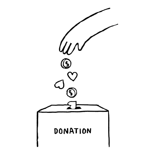
90% of all gifts to Life.Church come through the Giving feature in the app, making it the primary tool for supporting the church’s work
Encouraging recurring giving and providing visibility into giving impact fosters a stronger connection between givers and the church
A smooth and intuitive giving process removes barriers for those who intend to give
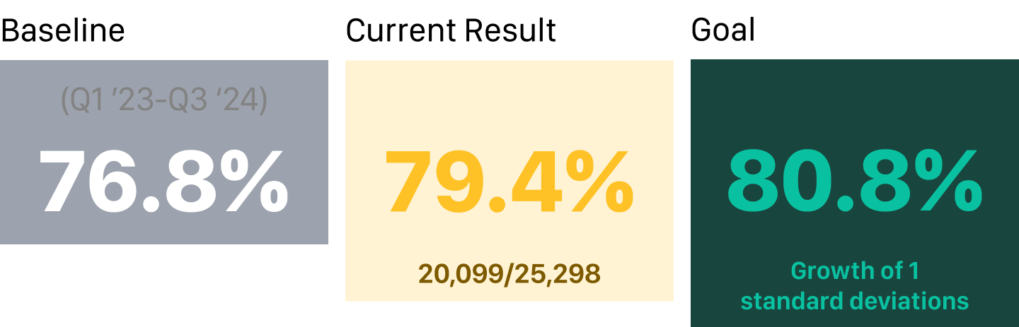
Our goal was to increase giving to 80.8%. To achieve this, we moved beyond anecdotal feedback and conducted focused Discovery Research to quantify the problem and identify the most impactful leverage points.


Our analysis confirmed a widespread problem of "Giving Drop-Off" rooted in friction, which ultimately led to payment frustration and decreased motivation. We quantified this by analyzing key engagement metrics:
Due to diverse user base meant that a one-size-fits-all solution for increasing consistency was impossible. Therefore, our focus shifted entirely to segmentation. We needed to categorize givers based on their behavior, understand what truly motivates them, and match that to the specific friction point they needed solved.
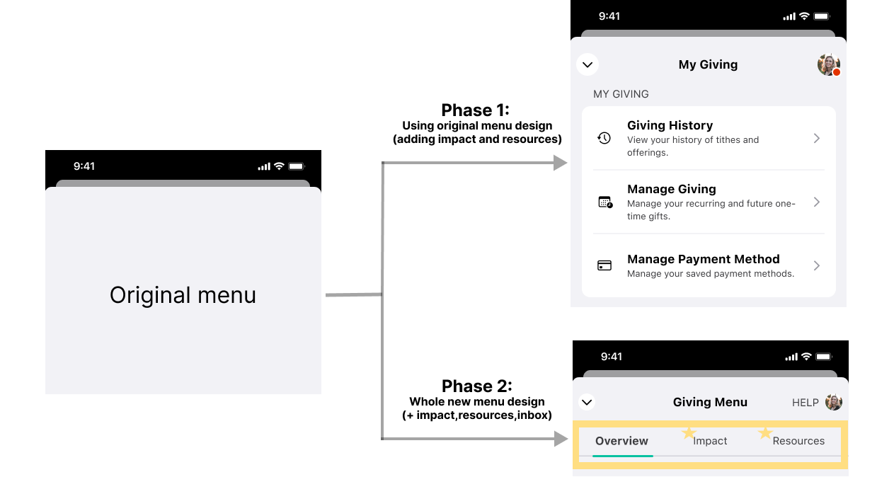
Based on the result of the users and different assumptions for each solution around 4 risk areas, PM and I identified that we need a new dashboard for giving.


However, midway through the design, the leadership determined a complete menu redesign posed too much risk. Changing the whole dashboard at one time risked breaking user habits and disrupting current giving operations, so we opted instead for a phased, incremental approach to quickly deliver our high-impact features directly within the familiar flow.
Phase 1: Feature Enhancement
We are focusing on delivering new features and key improvements (High Impact, Low Confidence feature first) while keeping the current familiar interface. Critically, we'll use in-app notification cards and guides to introduce these features and the new workflows they bring.
Phase 2: Design Relaunch & Continued Growth
Once the feature set is complete, we'll introduce the all-new design.
While iterating on my design, I focused on conveying necessary information and implementing key features. Below are some explorations of the key elements.
Our goal was to create a dedicated space for internal communication within the platform, aimed at smoothing workflow processes and enhancing transparency.
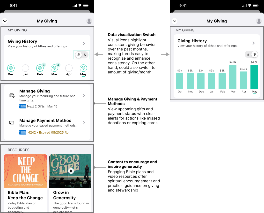
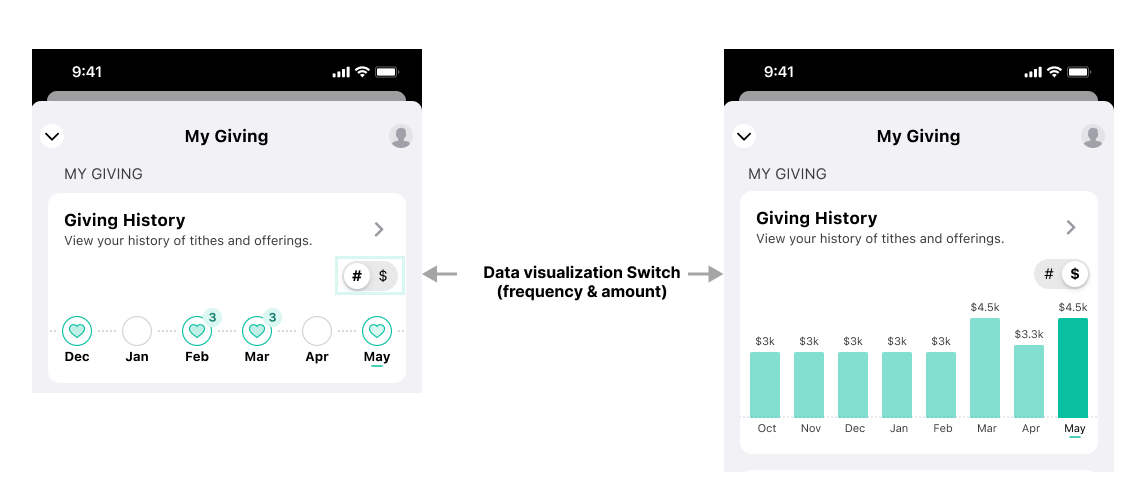
To encourage consistent giving, we designed a data visualization that highlights frequency, comparison trends, and potential missed gifts. By providing givers with clear, actionable insights into their contribution patterns, the visualization aims to enhance engagement, remind them of opportunities to give, and foster long-term commitment.
After UX Tweak prototype testing and in-person interview, we identified key areas of confusion that impacted the effectiveness of the giving history visualization. Users struggled to recognize fund icons, found certain visual elements ambiguous, and desired more intuitive navigation.
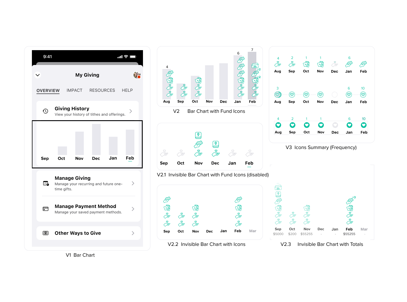
The visualization focuses on tracking donation frequency rather than fund type, ensuring clarity and ease of use. Clear and intuitive navigation has been prioritized, while avoiding guilt triggers—such as prominently displaying gaps in giving history—to create a positive and encouraging user experience
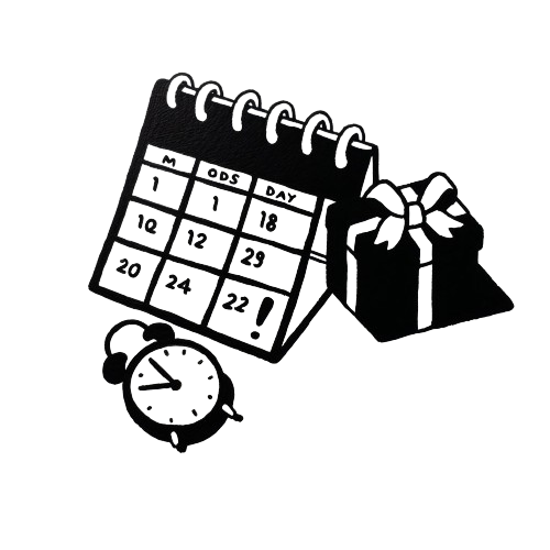
By allowing users to customize reminder frequency, we support their giving habits while respecting their desire for a more intentional and meaningful giving experience.

I created a clickable prototype on Figma to usability testing and fake door test with 30 existing users within a week and received positive feedback.
1. 56% of users who enabled reminders gave within the reminder period.
2. $485K additional giving in first 4 months
Thank you for reading this case study! If you’re interested, feel free to check out my other projects in "WORKS"