

In order to launch the website in two months, to quickly capture product vision and MVP in mind is essential. It is also worth noting that capital and technical constraints had to be taken into consideration. The proposed solution was to provide a site for seller easy to trust and use.
For a cash offer company typically has two primary groups of stakeholders: clients and target users. For the current company, it focused on sellers first.
1. Home Sellers: The primary clients of a cash offer company are individuals or families looking to sell their properties quickly, often in need of a fast and hassle-free sale.
2. Real Estate Investors: Some real estate investors who purchase properties for investment purposes can also be clients of cash offer companies. They may seek to sell or buy properties through these platforms.
The primary goal for clients (sellers) is to sell their properties quickly, often in as-is condition, and receive cash offers without the need for extensive repairs, staging, or a lengthy listing process.
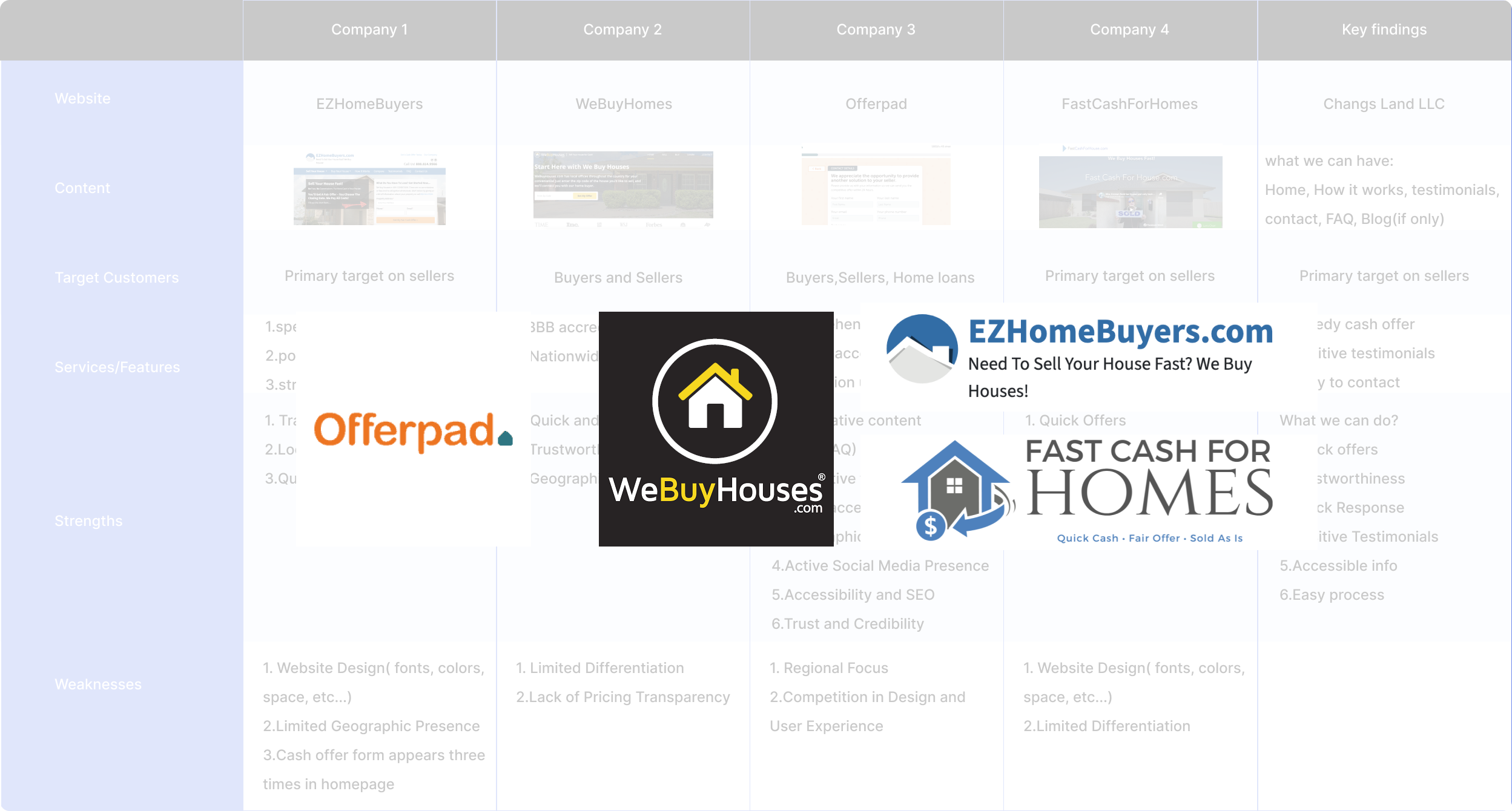
Competitive benchmarking has shown that enabling target sellers to browse and contact the agent with less steps and to gain credibility for the company can enhance user engagement.
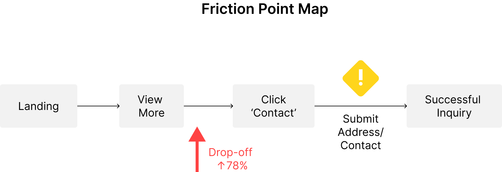
Findings: Providing the address to cash home buyer is an essential info. Since we target on for urgent sellers: Easy and quick process, testimonials for gaining credibility are the keys
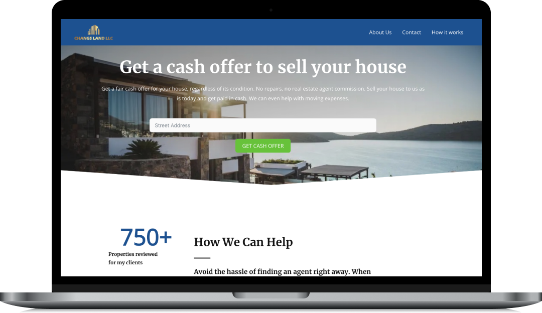
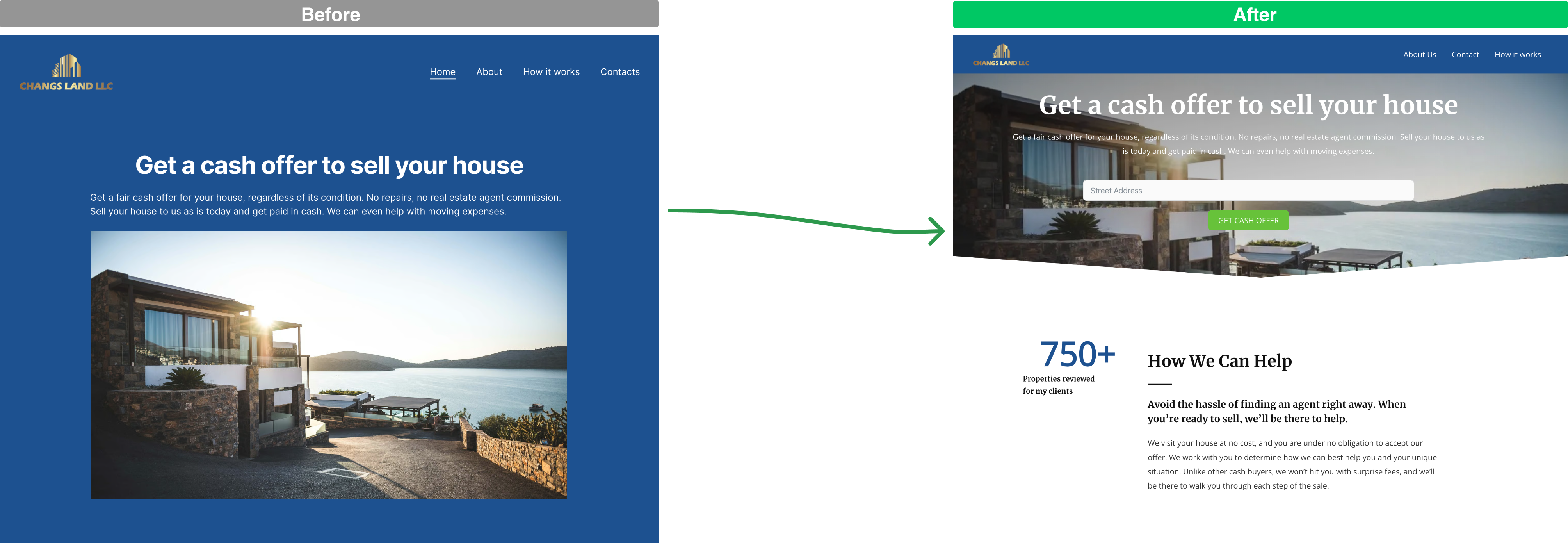
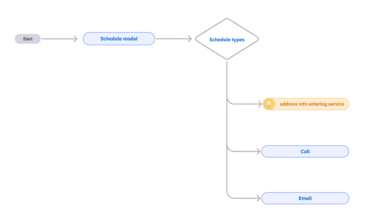
The first iteration focused on quickly validating the core market need and product vision. While this version (featuring a basic schedule modal flow) successfully proved initial market demand, it generated user dissatisfaction and hindered lead qualification due to poor address capture.

Based on client dissatisfaction and the need for higher-quality leads, the second phase focused on a redesign that was both intuitive and technically sound.
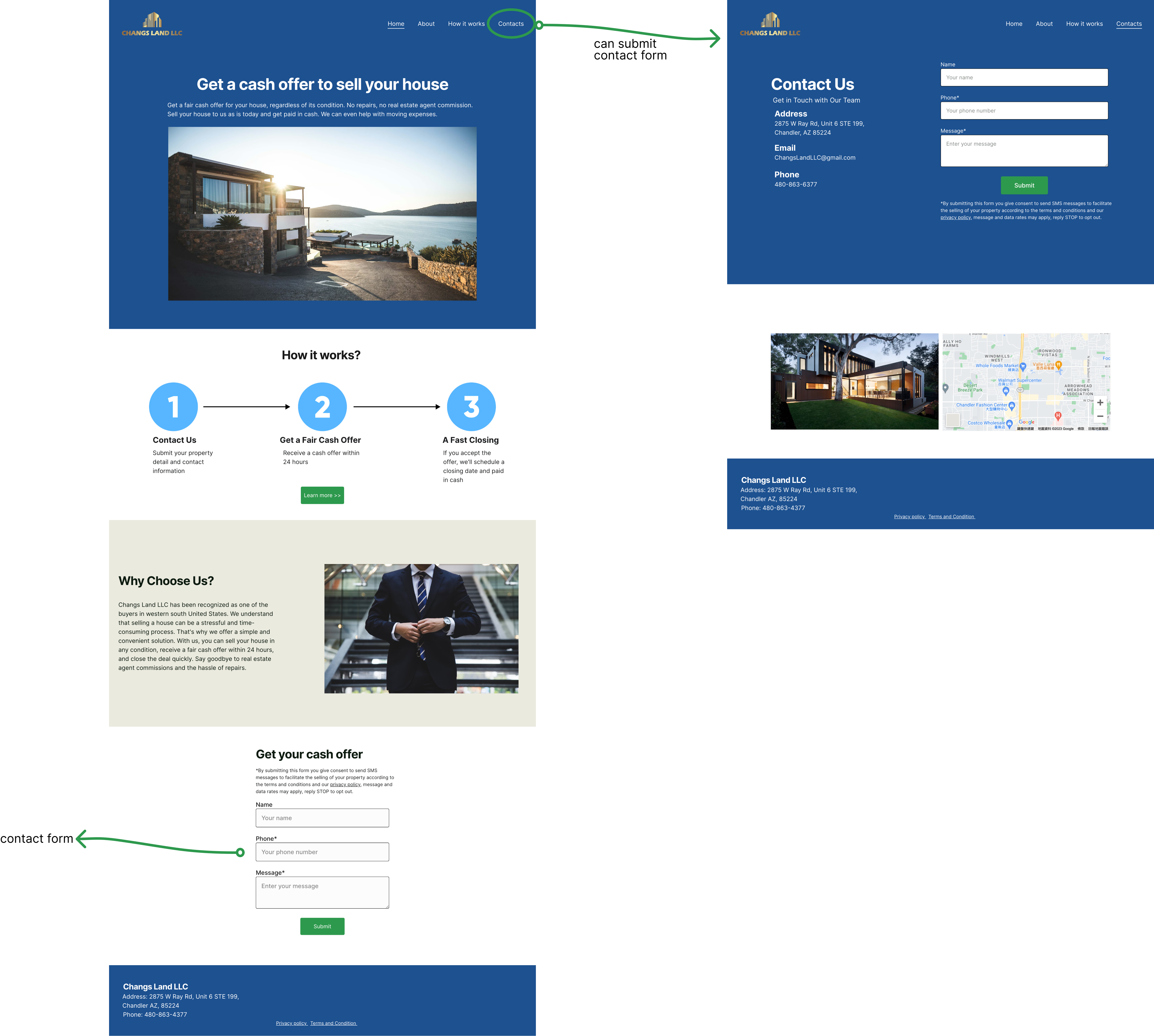
1. Information Architecture (IA)
2. The Address Challenge (Engineering Feasibility)
The most critical technical challenge was enabling users to seamlessly input their address on the homepage and have it automatically populate subsequent forms to maintain a low-friction experience.
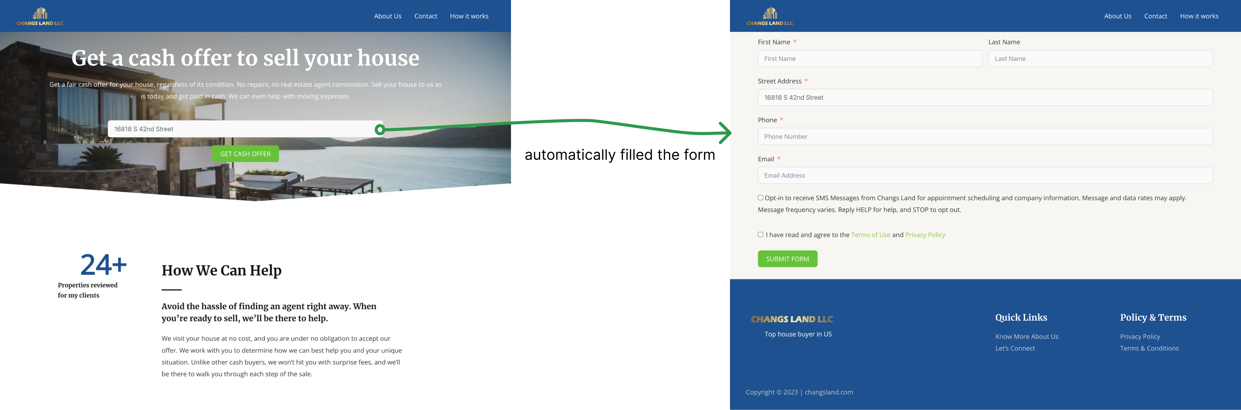
The design strategy was validated by the market, successfully turning the website into a high-performance sales funnel.
"The site looks more delicate and easy to use! "
The improvement doesn't end here. If there were more designers and developers:
Thank you for reading this case study! If you’re interested, feel free to check out my other projects in "WORKS"
